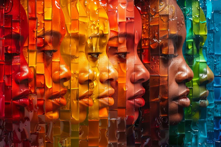
Color psychology, once regarded as a niche within design or marketing, has evolved into a respected field intersecting neuroscience, environmental psychology, and physiology. The colors surrounding us are far more than visual stimuli—they act as psychological signals that prompt emotional and cognitive shifts, shaping everything from decision-making speed to long-term stress levels.
Reds and oranges, often associated with warmth and energy, have been found to increase heart rate and arousal, stimulating emotions such as excitement and urgency. From an evolutionary standpoint, these colors may have served as survival cues—signaling ripeness, fire, or danger—thereby triggering heightened alertness. In modern environments, such hues are frequently used to encourage passion and physical activity. However, excessive exposure can also lead to overstimulation or anxiety, highlighting the delicate balance between engagement and fatigue.
Blues and greens, in contrast, tend to calm the mind. Their association with sky, water, and foliage taps into primitive instincts for safety and stability. Numerous studies indicate that exposure to these cooler tones can lower blood pressure, decrease cortisol levels, and foster sustained attention. This physiological reaction is now being harnessed across learning spaces and workplaces that demand focus and cognitive endurance.
Recent neurological research provides a deeper understanding of why these effects occur. Light enters the retina and sends wavelength-specific signals through the optic nerve to the brain’s limbic system, the region that governs emotion, motivation, and memory. Here, colors influence hormonal activity—including melatonin, serotonin, and cortisol secretion—that, in turn, modulate alertness and mood. Blue-enriched light, for instance, has been shown to suppress melatonin production, helping maintain wakefulness and cognitive efficiency during the day, while warmer hues can support the natural wind-down process toward evening.
Cultural factors also shape our color perceptions. While red might symbolize luck and prosperity in Eastern cultures, it can represent warning or danger in Western contexts. This intersection of biology and culture reveals color’s multidimensional impact—both physiologically and socially constructed. As designers, educators, and organizational psychologists increasingly integrate color awareness into functional environments, color choice is no longer a matter of artistic intuition but an evidence-based element of psychological design. Across classrooms, offices, and hospitals, a growing body of data supports the idea that color actively mediates human well-being and performance.
A growing corpus of research demonstrates that color selection in the workspace can influence measurable aspects of productivity, from task speed to mental accuracy. Studies in cognitive neuroscience reveal that soft blue environments increase prefrontal cortex activity associated with sustained attention and error reduction. These tones appear to reduce cognitive strain over prolonged focus periods, making them ideal for analytical or knowledge-based professions.
Contrastingly, bright yellows and fresh greens activate the brain’s dopaminergic pathways, promoting enthusiasm and creative ideation. Office environments incorporating these hues often report higher levels of group interaction, ideation fluency, and positive affect—factors critical in industries that rely on innovation and teamwork. Moderate saturation levels tend to maintain motivation without overstimulation, while balanced brightness avoids glare-induced fatigue.
Environmental psychologists emphasize how variations in saturation, hue, and luminance engage distinct physiological mechanisms. For example, high-contrast schemes can improve visual ergonomics and reduce perceptual monotony, helping workers maintain engagement. Pastel or low-saturation backgrounds support cognitive clarity by minimizing eye strain. In open-plan offices, strategically alternating warm and cool zones can cater to different work modes—creative brainstorming in lively spaces and deep concentration in calmer, cooler-toned areas.
Modern workplace design increasingly incorporates evidence from these studies. Architects and interior designers collaborate with neuroscientists to craft environments that align lighting spectra and surface color to the circadian rhythms of occupants. Similarly, the user-interface design of digital platforms mirrors this logic: background color and display temperature are optimized for readability and endurance, reducing digital eye fatigue in prolonged remote work scenarios.
In industrial and healthcare settings, color coding enhances safety and operational efficiency—red used for alerting and blue for informational cues—while also influencing worker morale and perceived comfort. The convergence of neuroscience, design, and ergonomics demonstrates that color functions as a measurable variable affecting workforce well-being, cognitive stamina, and emotional resilience.
As society continues integrating scientific insights into architectural and digital design, the role of color transcends decoration. It becomes a dynamic stimulus shaping how we think, feel, and perform. Recognizing color as both a psychological and physiological factor marks an important step toward human-centered, research-informed environments that not only look aesthetically harmonious but also foster health, focus, and creativity at the biological level.
In this light, the science of color is not simply about preference or fashion—it is about aligning our visual surroundings with the rhythms of the brain and body. The right palette can subtly yet powerfully shape emotional stability, inspire innovative thinking, and sustain productivity, proving that color truly is both an art and a science of human performance.


